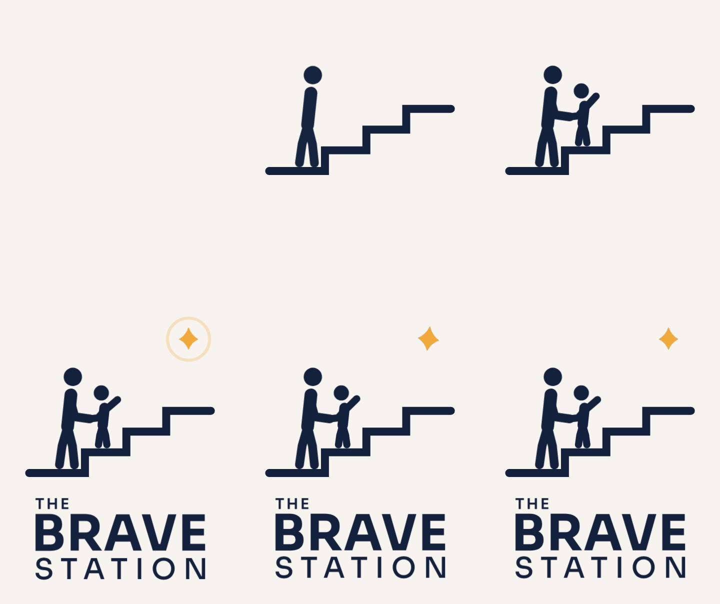
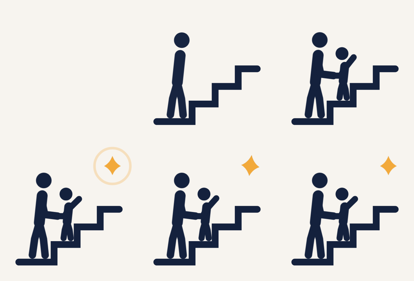
The round 3 drafts were the right ideas, drawn too roughly to work as a logo. These fixes apply to every option.
FiguresEvery figure is redrawn on one skeleton with real proportions for its age, in one stroke weight shared with the stair. No white outlines, so no seams where limbs overlap.
The babyNo longer lies flat (it could read as a fallen child). It is now in tummy time, head raised.
The toddlerIn 01.3 the toddler looked as if slipping down the stairs. Now the pose clearly pulls up and reaches.
North StarSolid gold, larger, and the only star. The beige and grey halo and the star on the I are gone.
WordmarksTwo new wordmarks in Sora with calmer weight contrast: W1 on one line, W2 stacked. W2 fixes the wide-wordmark problem in horizontal layouts.
ArabicOptional bilingual versions with محطة الشجاعة in Readex Pro, a typeface that matches Sora’s geometry. The English logo stays primary; the Arabic can be dropped without redrawing anything.
Small sizesA shared small mark (three steps and the star) for favicons and anything below 32 px.